Let me ask you a question. How would it make you feel if your boss, a line of business manager or C-level management was to walk into your office right now or send you a quick email saying "Hi, can you give me a statistical update on our project?"
Most likely, you wouldn't be very happy, right? Some days, that's all you seem to do: manipulating data, generating graphs, preparing PowerPoint presentations or writing email status updates. In reality, there is no such thing as a quick update. Your information consumers all want something slightly different.
It starts with the different information needs. The C-Level management needs a 30,000 level overview that you are on schedule, on budget and what the return-on-investment looks like. They might like to see a visualization of the global progress on a map and some high-level dashboards. The business managers are more interested in a granular view of their department or line of business, while schedulers need a view on their piece of the overall plan. The engineers need a printed-out drop sheet.
So, how do you serve all these different reporting needs? Easy - with Dashworks Dashboarding.
Introduction To Dashworks Dashboarding
Our cutting-edge Dashworks software solutions enable enterprises to control every aspect of their IT migration projects from data warehousing and asset readiness tracking to end user communications, self-service, and deployment. One of the cornerstones of the Dashworks software is a number of pre-canned dashboards and report options that get regularly used by our customers as a part of these migration projects.
What you may not know is the extent of the data that is held within the Dashworks Analysis Data Warehouse and Project Systems.
In the past, many of our clients have requested that our consultancy teams build additional reports to analyze this data while others may export the data to Excel spreadsheets to produce graphics and perform a "what if" analysis to assist them in decision making.
Unfortunately, these methods use snapshot data which is prone to formatting issues among other challenges.
Well, our customers spoke, and we listened.
After taking a look at the methods listed above we investigated how we could simplify reporting and graphical presentation of frequently required outputs, while still offering as much agility and flexibility as possible. After all, we do not want to subject our customers to a development cycle simply because they need a slightly different cut of the data.
A Powerful Combination: Juriba Dashworks & Microsoft SQL
The solution? To achieve simultaneous efficiency and simplicity, we have aligned Dashworks with Microsoft's evolving SQL BI strategy and reporting toolsets for KPIs, tabular, and paginated reporting across browser, tablet and smartphone clients.
These toolsets provide a wealth of options that allow Juriba to provide templates that can be applied to your environment with minimum effort, while still allowing bespoke design if required.
The template libraries we have produced and continue to create are based on the following optional client tool sets, all of which allow us to present Data to you in new ways.:
- Datazen
- Microsoft Power BI
- Excel Pivots
- Microsoft SQL Server Reporting Services (SSRS)
Dashworks uses the Big Data capabilities of Microsoft SQL Server Analysis Services (SSAS) multi-dimension architecture for data processing. Although this brings a number of benefits to storing & retrieving Big Data, it is not very friendly to customers that want to easily create reports themselves. Our primary focus is to simplify the reporting of Dashworks data by using a self-service model via interactive Dashboards and/or by simplifying data structures to a tabular model. This has resulted in easier to understand data structures for report self-creation.
Excited to see what we got? Here is a gallery of some of the currently available reports and their use descriptions:
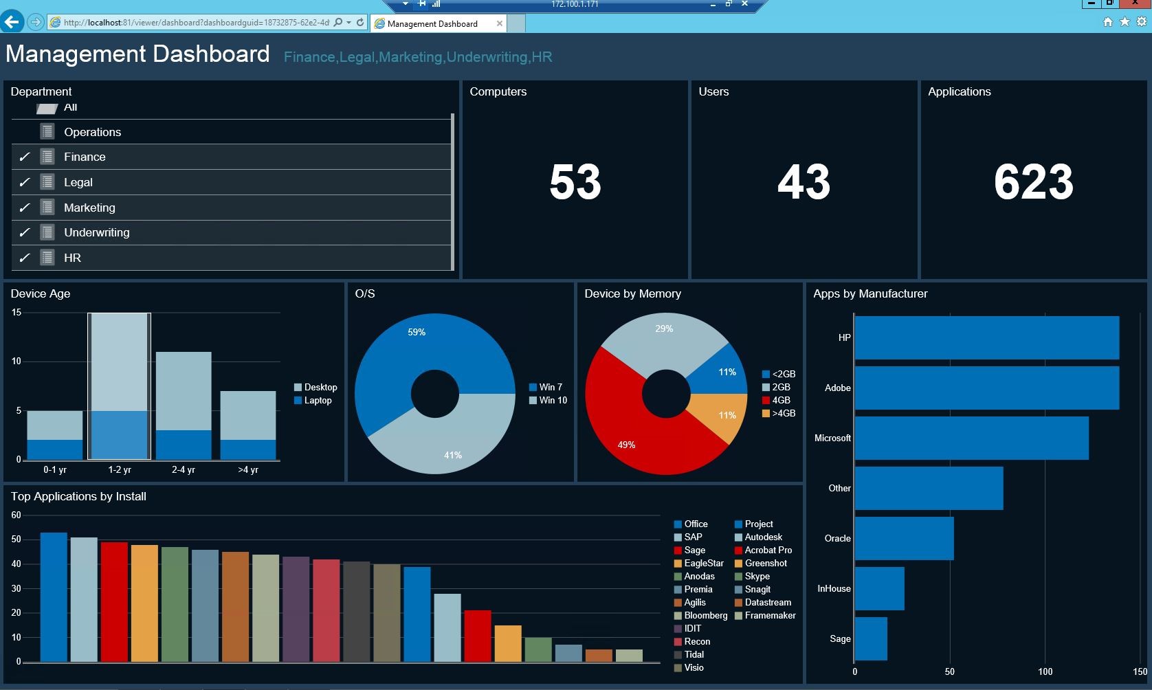
Estate Overview by Selected Department

Using Datazen, this report generates a KPI Data view of your estate from the Analysis Data Warehouse which includes a total count of computers, users, and applications, broken down by types. The report also includes where each computer is used in the organization based on the department selected. Drill through capabilities allow you to see the data behind the KPIs.
Although this report was designed to be viewed on a PC based browser, smartphone and tablet versions are also available. In fact, similar reports can also be provided in Power BI or SSRS.
Application Packaging Forecast by Month
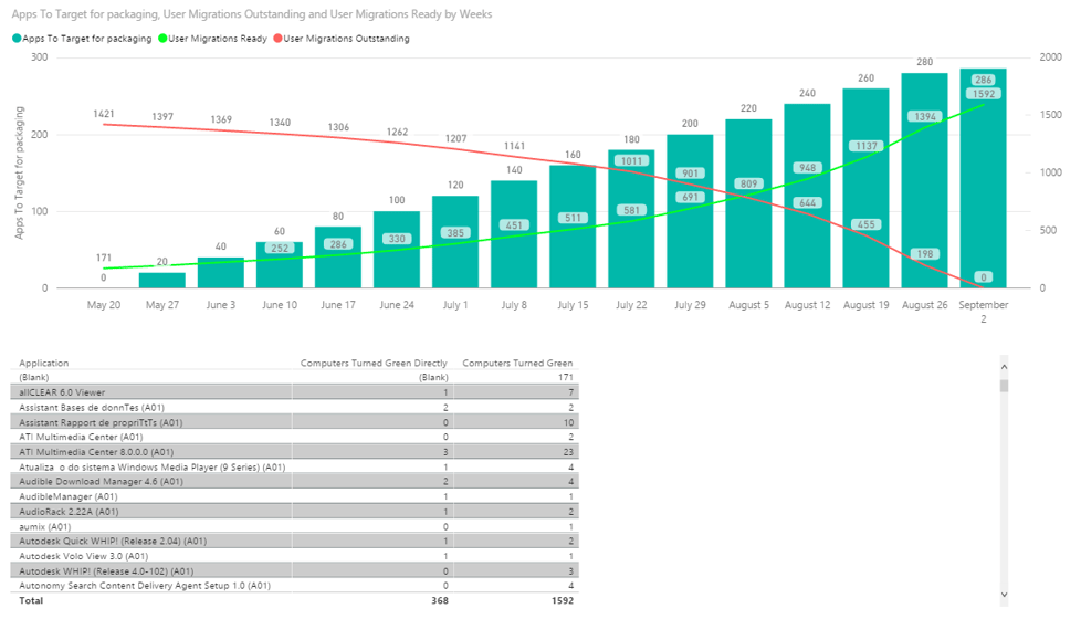
Using PowerBI, this report shows the quantity of users that can be migrated over time by targeting certain apps for packaging. It is essential for helping packaging groups sequence their app packaging to achieve the highest opportunity for user or computer migration over time.
Spreadsheet Analysis "What If" Reporting
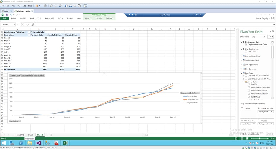
The data in the Excel spreadsheet is a real-time extract using a connector to the Project Warehouse that is automatically refreshed in real-time allowing pivot table views of the data. In this table we have selected PivotChart fields representing monthly forecast, scheduled and migrated date with a graphic to represent the data.
Customers can extract any information and model any "what if" scenario from the data in both analysis and Project warehouses and use all the functionality from a familiar front end tool.
Application Compatibility Status
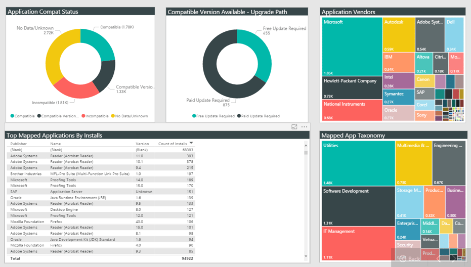
A Power BI report uses the data collected within the Dashworks Analysis data warehouse. The image above shows a combined summary of the application compatibility status and upgrade path availability using data from a 3rd party compatibility catalogue from BDNA. The report also shows the top application installs plus a simplified view which uses topology graphics of top vendors and top applications categories installed. Selecting items in the topology redraws the table data and doughnut images.
Note: BDNA is available from Juriba and can be supplied as part of your installation at an additional cost.
Migration Status by City Chart
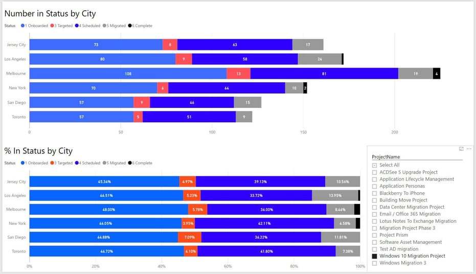
The Power BI graphic shown above displays the migration status for the Windows 10 migration project by totals and percentages according to cities in scope with data from the Projects data warehouse. By selecting a different project from the right hand table, the graphic will be re-drawn with the relevant detail or combination there of.
Global Migration Readiness by City World Map
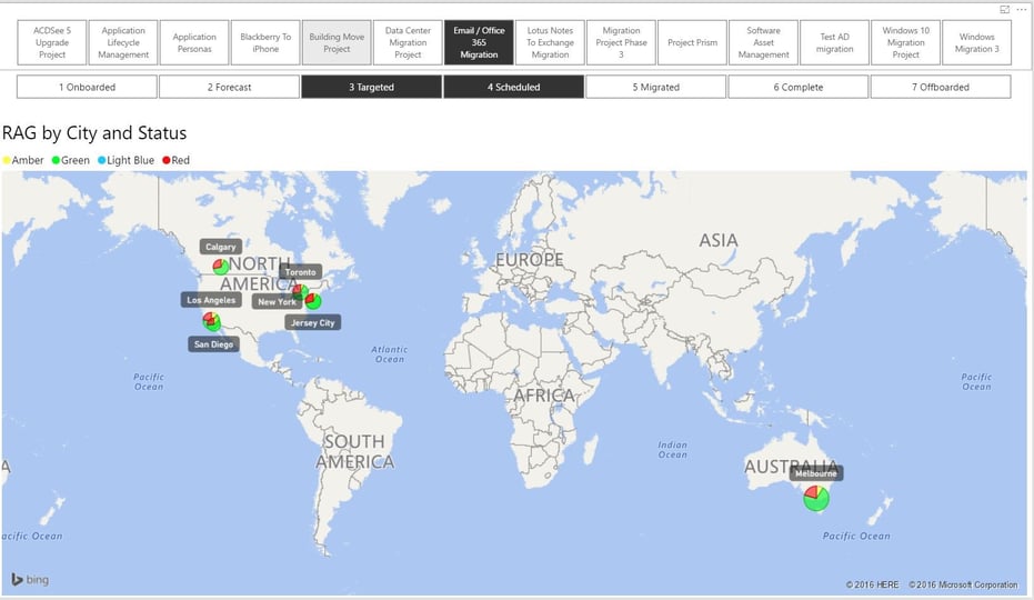
Above is a Power BI graphic showing the RAG status for the Email/Office 365 Migration, specifically those users who are targeted and scheduled (highlighted in black). Not only can any individual project can be selected, but any combination of migration states for an instant visual of global progress may be selected as well.
Migration Status by Department
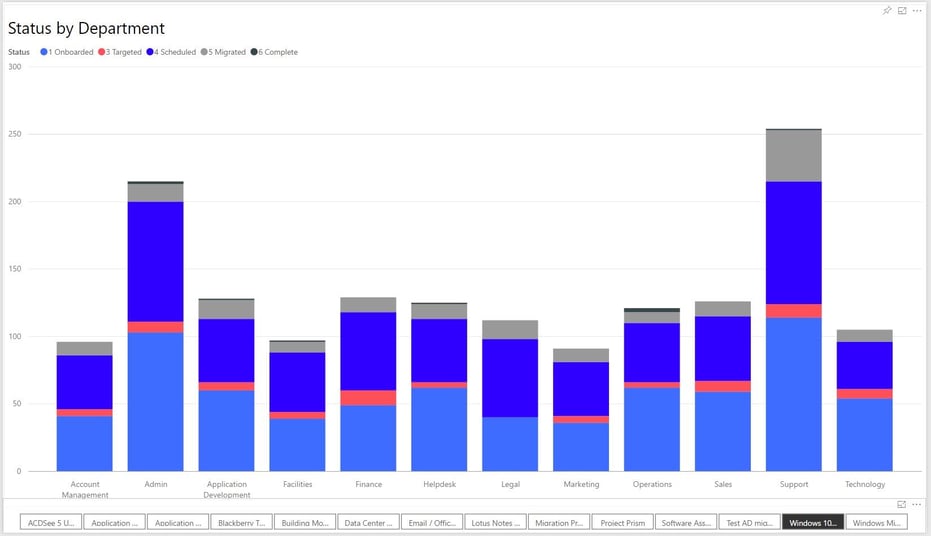
This Power BI chart shows a Windows 10 migration project migration status organized by department. This implementation has multiple projects running and would allow the PMO to view the status of each project with one click simply by selecting the project of interest at the bottom of the Dashboard.
Weekly Deployment Progress
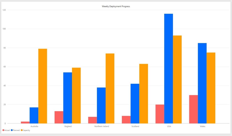
This final Power BI report shows the deployment progress by country, charting actual deployments by those planned for the week, and against available deployment capacity resources.
Conclusion
Now, with these reporting and dashboarding options in your back pocket, you would need to break a sweat! With a click of a button, you have all the information you need — always up to date. No more fingerpointing, shifting blame or becoming the scapegoat! This give you the tools and the data you need.
Pro Tip: Always define reporting and dashboarding needs at the beginning of the project so you can set up all the dashboards and reports up ahead of time!
Ready To Get Started?
If you'd like to take a deeper look into the Dashwork's tool and its reporting capabilities, we'd be happy to show you first hand. Let us guide you through the Dashworks software to give you the best opportunity to see how you can prepare for an enterprise IT migration in the easiest and fastest way possible by scheduling a demo today. If you are interested in using any of these reports for your implementation or exploring the options open to you mentioned above, please contact either your account manager or professional services who will be glad to assist.
Topics:


.png)

%20vs.%20Juriba%20Dashworks%20(Updated%2041218).jpg?width=1600&height=900&name=Microsoft%20Windows%20Analytics%20(Upgrade%20Readiness)%20vs.%20Juriba%20Dashworks%20(Updated%2041218).jpg)


