
.png?width=1200&height=627&name=DPC_Featured%20Image_Manage%20Lists%20Juriba%20DPC%205.18%20(1).png)
New grouping, filtering, and dependency visibility make lists far easier to manage, even when you've got hundreds of them.
If you've ever opened the list panel and been met with a wall of lists, half of them shared with you for scoping reasons you can no longer remember, then Juriba DPC 5.18 is for you.
Lists do a lot of heavy lifting in Juriba DPC. They scope your projects, feed your dashboards, drive your automations, and power self-service. That's exactly why they multiply: the more you rely on them, the more they pile up. And past a certain point, two things start to hurt. Finding the list you actually want becomes a scroll-and-squint exercise. And changing a list starts to feel risky, because you can't always see what else depends on it.
You've told us as much, repeatedly. So for 5.18, we went back to the list panel and reworked how you find, understand, and safely change lists. Here's what's new.
Your lists, sorted into groups automatically
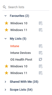
The panel now splits your lists into four groups: Favourites, My Lists, Shared with Me, and Scope Lists.
The point isn't tidiness for its own sake: it's that you can now tell at a glance where a list came from. The ones you own sit apart from the ones colleagues shared with you, which in turn sit apart from lists used purely as scope elsewhere in the platform. Those scope-only lists were the worst offenders for clutter, so they get their own group: out of your way, but still there when you need them. Each group shows a count, and empty ones simply don't appear.
Favourites you can actually see
Favourites used to hide behind a small icon that was easy to overlook, and marking one meant digging into a list's settings.
Now there's a star on every row. Click it, and the list jumps straight to the Favourites group at the top of the panel. Your default list, the one that loads when you open a list page, sits up there too, pinned with a home icon. Need a different default? Set it from the right-click menu with Set as Default.
Filter by project or tag
When your work spans several projects, the right list is usually buried among many unrelated ones.
You can now filter the panel by project, by tag, or both at once. Pick a project, and you'll only see its lists. Tag filtering takes multiple selections, so you can layer them to narrow things down. Whatever you've applied stays visible on screen: no wondering why half your lists have vanished. These filters replace the old Group By option with something a lot more flexible.
It remembers where you left off
Filters and expanded groups are now saved between visits. Set the panel up the way you like it, come back tomorrow, and it's still that way.
Preferences are stored per object type, so the view you use for applications doesn't bleed into the one you use for users, and so on. Small thing, but it's the kind of small thing you notice every single day.
Say what a list is for
There's now a description field on the List Information panel. Use it to spell out what a list is for, what it scopes, or anything else worth knowing.
It sounds minor until a list gets shared across teams or reused on another project six months later, and nobody can remember why it exists. A sentence of context saves that conversation.
See what a list touches before you change it
This is the one that takes the fear out of editing lists.
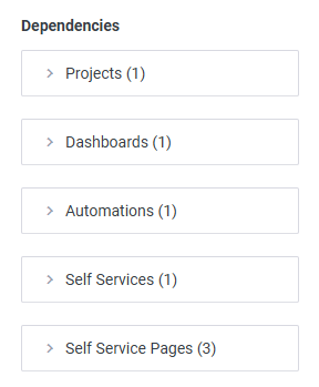
The List Information panel now includes a dependency section that shows everyone where a list is used: project scope, automation scope, self-service scope, self-service page scope, dashboard widgets, and filters that power other lists. And if you go to change or delete a list that's in use, you get a warning first, so you can weigh up the knock-on effects before you commit rather than discovering them afterward.
A clearer view when building lists
Building a list means working through project tasks in the columns and filters panel, and that panel had grown unwieldy. Tasks appeared as one flat run, each name prefixed with its project and stage, so the part you were actually scanning for came last.
We've reorganized it. Tasks now sit under their stage (in your configured stage order, tasks in task order), and the section is now called Stages & Tasks. Alongside that:
- Task names drop the project and stage prefix, so the name you're looking for comes first
- Last changed date and user move into their own Tasks History section, out of the main view
- The panel is resizable, for when you're working through a big hierarchy
- Sticky headers keep the current stage in sight as you scroll
Little of it is dramatic on its own. Together, it's the difference between hunting and finding.
Consistent controls, wherever you are
As part of this work, we also aligned the Info and Security controls so they behave consistently across lists and dashboards. You no longer have to remember which one you're in: they just work the same way.
How to get this functionality
List management improvements land for everyone in 5.18. If you're on cloud, they'll arrive with your scheduled update. On-premise? Your Customer Success Manager can walk you through the upgrade, and it's worth asking them about the new near-real-time data processing in this release too, which is a story of its own.
Open the list panel after you upgrade. We think the wall of lists will feel a lot more like a filing cabinet.
Juriba: Built for IT people, by IT people

.png?width=1200&height=627&name=DWOA_Featured%20Image_The%20Practical%20Business%20Case%20for%20Digital%20Workplace%20Operations%20Automation_Blog%20(1).png)